Metadesign and Westiform: Mobiliar Brand Refresh
Mobiliar presents itself in the refreshed corporate design created by Metadesign. The visualization of the new appearance on and in the Mobiliar buildings is significantly accompanied by Westiform.


Swiss Mobiliar is the oldest private insurance company in Switzerland. Metadesign was entrusted with the task of resolutely leading the traditional brand into the future - especially in the context of new digital requirements and opportunities.

Mobiliar is characterized by its optimistic basic attitude. At the heart of the brand is the attitude that damage is part of life - and to resolutely support its customers in the event of a claim. In this way, Mobiliar underscores its unique position as a cooperatively anchored company in the insurance landscape.
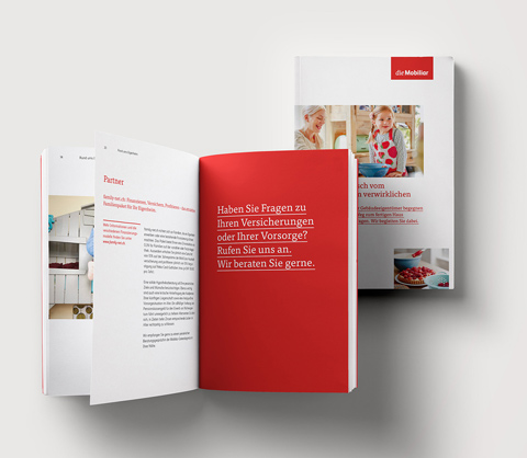
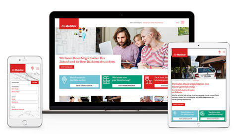
Based on this positioning, Metadesign has further developed the brand presence. The logo in different language variants and the striking use of the color red convey the brand as a close partner nationwide - from advertising to digital media to the general agencies. Particular importance is attached to mobile digital applications in the new appearance. The new appearance takes into account that the brand is staged decentrally via the general agencies. The popular claims sketches remain an essential part of the advertising communication. A defined brand language also creates the basis for communicating verbally in the spirit of the brand.
Metadesign initially developed the first prototypes together with the experienced illuminated advertising company Westiform and the responsible person at Mobiliar. In a coordination and development process, the products were finalized - now the time has come, by summer 2016, all locations throughout Switzerland as well as 24 special locations will be equipped with new lighting elements and lettering.
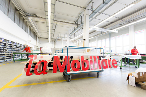
Westiform accompanied the corporate design change from the very beginning, as it states in a press release. At the beginning of the project, the current situation was recorded at all locations. The product range includes illuminated signs, light boxes and pylons in the outdoor area, as well as foiling in the indoor area. On signs, the word mark will now appear in white on a red background. The illuminated signs themselves will remain red, but will glow white on the sides to create a better connection between the individual elements. The largest neon sign will be installed along the highway in Giubiasco, rising an impressive 2.5 meters in height and measuring over 16 meters in length.
The redesign not only strengthens the luminosity and presence of the furniture, but also gives the lettering an elegant, modern character.