BMW has a new logo - what the branding experts say
On Tuesday, BMW unveiled a revised version of its own logo. The black circle has disappeared. Here's what Swiss branding experts have to say about the change.


Bavarian Motor Works (BMW) had actually planned to unveil the rebranding at the Geneva Motor Show, but as is well known, this fell victim to the corona virus (Werbewoche.ch reported). Instead, an online media conference was convened on Tuesday and the new i4 electric concept car was presented.

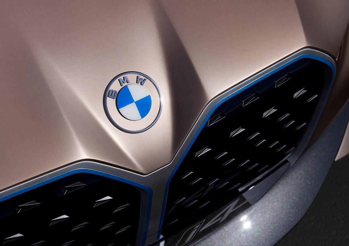
The eye was quickly drawn to the iconic BMW logo, which now has a transparent ring instead of a black one. The black rim has adorned the car company's trademark, which is modeled on an airplane propeller, since 1917. This is the fifth time in BMW history that the company has adapted the logo (see below).
In addition to transparency, the logo becomes two-dimensional. This is intended to appear more airy and modern and thus herald the electric future.