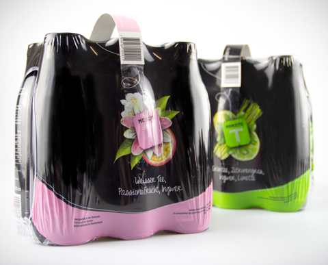
Pink: appearance created for Makoto-T
Just like the green Makoto-T, the white one also focuses on uniqueness. An attribute that Rosarot has consistently applied to the entire Makoto-T brand.


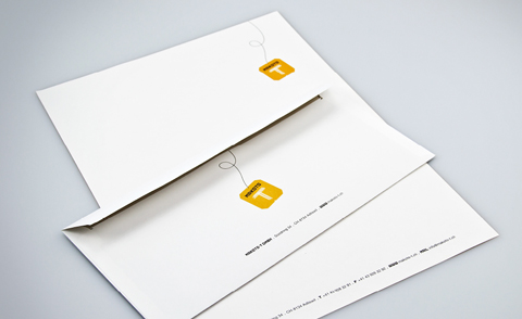
According to the press release, the T idea is trimmed for independence from A to Z: from A for appearance to B for letterheads and brochures, C for corporate identity, D for design, P for packaging, W for web and Z for target group language. And all this with the effect of eliciting an "Oh" even from the absolutely thirstless consumer in a saturated market. Makoto-T is supposed to make an understatement with black simplicity and thus stand out all the more on the shelf. The tea bag's label, which appears to be hanging out of the bottle, conveys that the beverage still contains "real tea," thus immediately creating trust and associating naturalness and health.


Responsible at Makoto-T: Tobias Stalder, Beat Bryan, Hansueli Preisig. Responsible at Rosarot: René Karrer (Creative Direction), Andreas Steiner (Concept, Text), Yolanda Lopez (Art Direction), Sandra Brandenberger (Graphics).