A fresh layout for SonntagsBlick
Fresh colors and elegant fonts: SonntagsBlick appeared in a new look on Sunday. The revised design is intended to ensure even greater reading pleasure. The relaunch is accompanied by a cross-media campaign.


Clear, bold, pioneering, close - these four brand values were the basis for the rebranding of the Blick Group. Also the SonntagsBlick received a modern logo in April 2021 - now the whole dress is added. From Sunday, the newspaper will appear in a new layout: with fresh colors, elegant fonts and even better readability.
"The new layout underscores the transformation that the SonntagsBlick in the past few years. The redesign is not only visually a commitment to print journalism, but also brings the high quality of the SonntagsBlick The content will also be more effective," Ladina Heimgartner, CEO of the Blick Group, was quoted as saying in a statement on Friday.
The new layout was developed in-house by a project group headed by Reza Rafi, Deputy Editor-in-Chief SonntagsBlick, and Christian Waeber, Art Director SonntagsBlick Magazine, designed.
"We are not completely reinventing ourselves, but have further developed the previous appearance. The need for information and clarity is great, and the new layout meets this desire. The SonntagsBlick stands for heart and mind - you should be able to see that at first glance," explains SoBli-chief editor Gieri Cavelty.
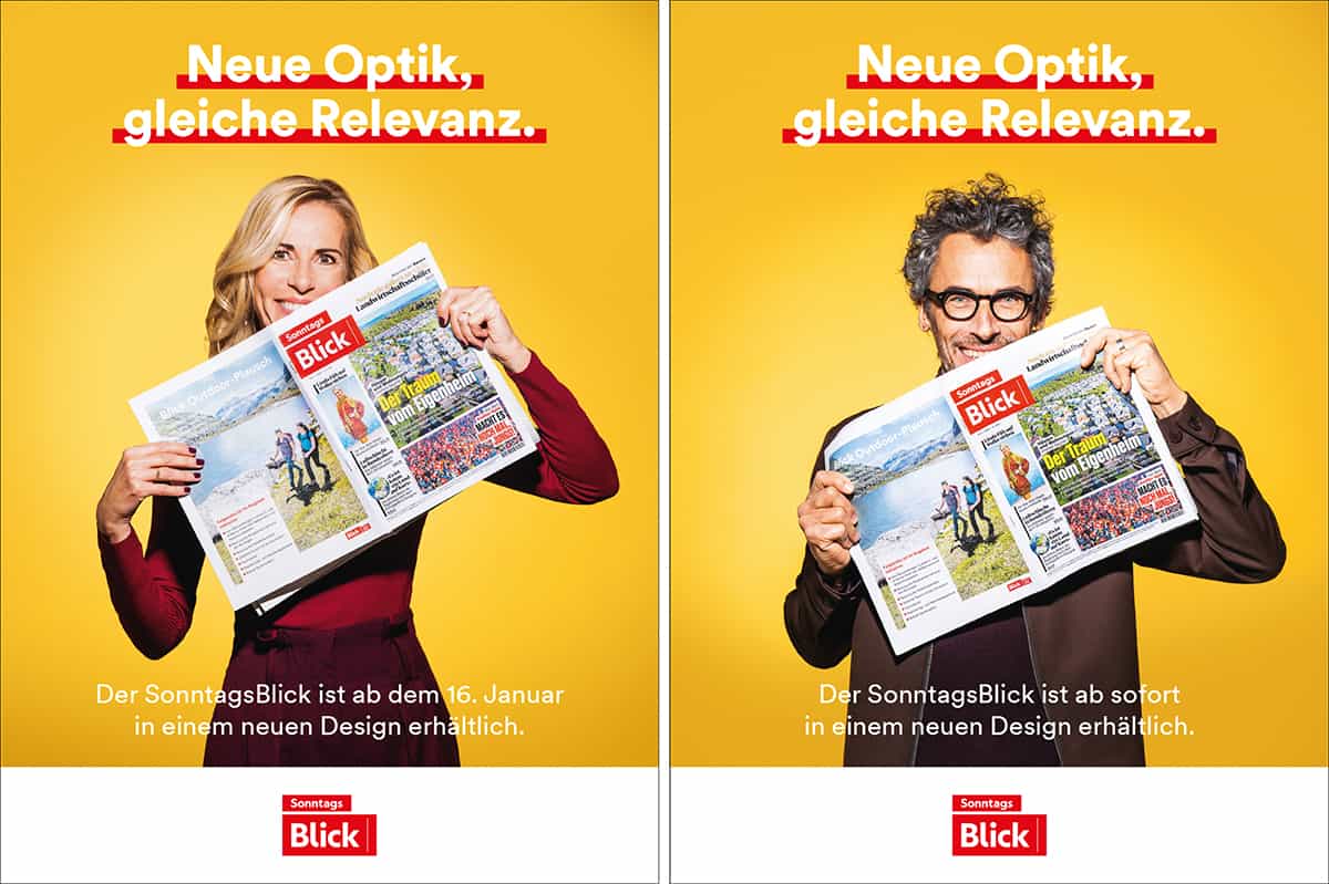
With two campaign subjects of its own and the message "New look, same relevance," the new SonntagsBlick-layout will be prominently advertised. Online on various channels, as well as target group-specific in the printed publications of the Blick and Ringier Group.

