Burger King: First complete rebranding in over 20 years
Burger King implements its first complete rebranding. The new, modernized branding and logo are designed to signal the brand's evolution in food quality, sustainability and digitalization.


Since 1954, Burger King has been encouraging guests to eat their own way and express themselves confidently with "Have it Your Way." Now, the brand is introducing an all-new visual design that will be present at all touchpoints of the customer experience. The more modern look marks the first complete rebranding in more than 20 years and is designed to more authentically represent Burger King's values. With the announcement of the new visual identity, the brand wants to make a strong statement about digitalization, as well as recent advances in taste and food quality standards, the removal of color, flavor and preservatives from artificial sources. In addition, the brand makes an ambitious commitment to sustainability.
The rebranding includes all visual design, restaurant design and the entire digital guest experience. The brand will introduce a new brand logo, packaging, restaurant merchandise, menu boards, crew uniforms, restaurant signage and décor, social as well as digital media and marketing activities. The result is a new look designed to signal confidence in the future while staying true to the "flame-grilling" tradition.
Each design element was intentionally redesigned to better reflect the new Burger King Food Journey and enhance taste and quality through design.

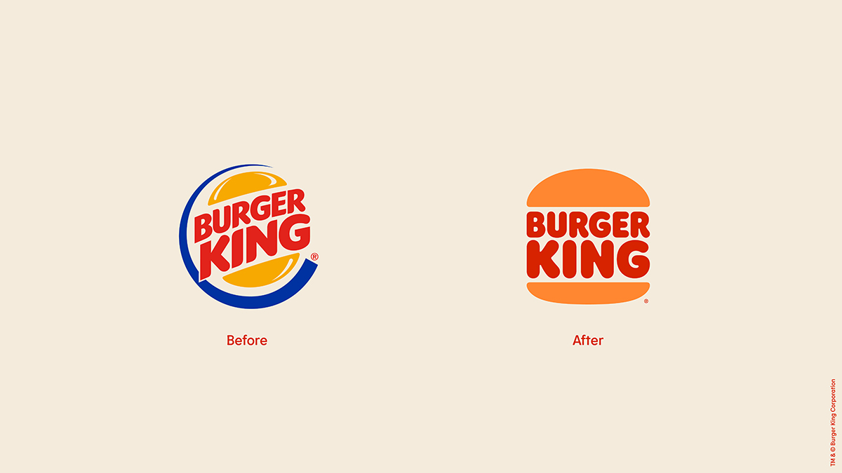
Self confident logo
Since the introduction of the previous logo in 1999, the industry has moved to a more modern, digitally friendly design language. The new, minimalist logo is designed to seamlessly adapt to the brand evolution of the times.
The selected brand colors are rich and vibrant. The new photography is clearly structured and emphasizes the sensory aspect of the food. Burger King's new, branded font is called "Flame." It is inspired by the shapes of BK foods - round and bold. And the new packaging prominently features the new logo, as well as bold colors and playful illustrations of ingredients.
"Design is one of the most important tools we have to communicate who we are and what we value. It plays a crucial role in creating desire for our food and enhancing the guest experience," Raphael Abreu, International Head of Design for the fast food chain, was quoted as saying in a statement. "We wanted to use design to create a desire in people for our food; for flamme-grilling perfection and, above all, for taste."
The new visual identity will be in place by the beginning of 2021. Burger King plans to implement the new design at restaurant locations around the world over the next few years.