How to make pressure
From 48 entries, the jury of the 2017 Swiss Print Award selected seven winners whose work whets the appetite for print: gold, silver and bronze in each of the commercial and publications categories, as well as the winner of the Peter Grob Special Award. Here they are. The award ceremony took place on Thursday in Locarno.


Category commercials
GOLD
Real Estate Brochure Adelphi
Client: Melbery
Producer: J. E. Wolfensberger

"The real estate brochure 'Adelphi' impresses with its conceptual implementation. The aesthetics of the building were carefully and confidently incorporated into the brochure. The 'gold metal panels' that provide privacy, incorporated into the black cover, backed with a gold paper, give the viewer a luxurious residential feel and the brochure a delightful, warm charm."
Marco Bieri
SILVER
Technology cluster Zug
Client: V-Zug Real Estate
Producer: J. E. Wolfensberger
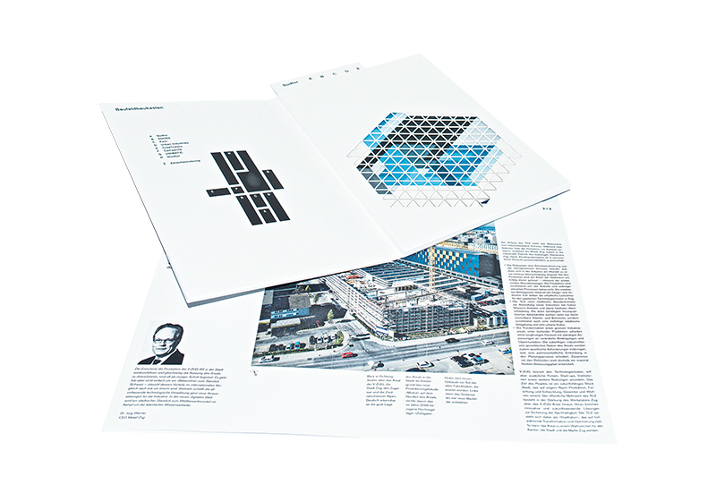
"The refined staging of volumes forms the basic design motif of the information format and places itself in the tradition of the constructivists and classical 'Swiss graphics'. Quite naturally, the publication succeeds in manifesting quality consciousness and design power. In an exemplary manner, the communicative idea is supported in this information format by graphics, printing, finishing and binding, and thus also makes you 'want to print' as a design package."
Christian Theiler
BRONZE
Agenda "Desire for Christmas wishes
Client: Casimir Meyer
Producer: Casimir Meyer

"There are many calendars, you get many, but you don't pay much attention to them. So the question arises as to why a calendar achieves third place in the commercial category of a 'Swiss Print Award'. The reason lies in the way it is made, because it makes you want to print. This calendar is both a calendar showpiece and a demonstration of what is possible today in digital printing with the appropriate finishing of printed matter and great paper. In each month, a wish is appropriately turned into a small work of art with paper, printing and finishing and can ultimately be reused."
Jean-Paul Thalmann
Category Publications
GOLD
Recipe Book Set Fire & Ring
Client: Fire ring
Producer: Print Center on the Rigi

"Feuer & Ring lit a fire in the jury: No wonder, the black double volume, flatbooks in slipcase, makes you 'want to print' - and 'want to grill'. After all, that is the main purpose to be fulfilled. It succeeds perfectly: with mouth-watering images, printed picobello on a black and white background. A culinary revelation, tangible, tactile. Noble typography, golden letters. Eye and touch dine along, devouring the visually presented grills. Leafing through them - one imagines oneself at a barbecue. You think you can smell the scent of a barbecue, and in your mind you're already tying on your barbecue apron."
Claude Bürki
SILVER
Anthology Lake Lucerne and Gotthard
Client: Imaginary Wanderings Press
Producer: Odermatt print shop
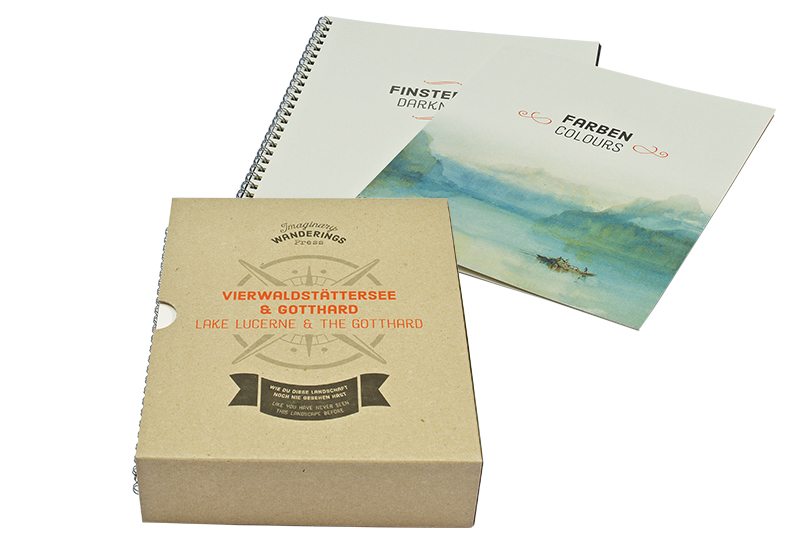
"Lust for print - that's how I imagine it: Curious, picking up an anthology with a slightly furrowed brow, opening each of the twelve booklets one by one, smiling, leafing through them in amazement, unfolding them, beaming, putting them together, touching them, discovering them, reading them enthusiastically with widened eyes, and putting them down again, delighted, enriched by knowledge and sensory experience - only to reach for this work again as quickly as possible and continue browsing. Curtain up, sink in."
Anne-Friederike Heinrich
BRONZE
Anniversary book Fumetto
Client: Fumetto Int. Comix Festival Lucerne
Producer: Engelberg printing

"I am honored to write this laudation. Firstly, because the object is a book, and secondly, because 25 years ago I was allowed to help create the means of communication for the 1st Comic Festival with the legendary puppet theater 'Condom of Horror'. What a coincidence. The book documents the 25-year festival history. Just holding it in your hands makes you want to print it or want more. The creators have managed to bridge the gap between tradition and modernity. Made with attention to detail. The design, but also the haptic craftsmanship is highly professional. It never gets boring, cheeky comics, beautiful printing techniques and clever gimmicks with format and manufacturing technology."
Michael forest bird
Peter Grob Prize
Printed in Wädenswil
Client: Stutz Media
Producer: Stutz Media
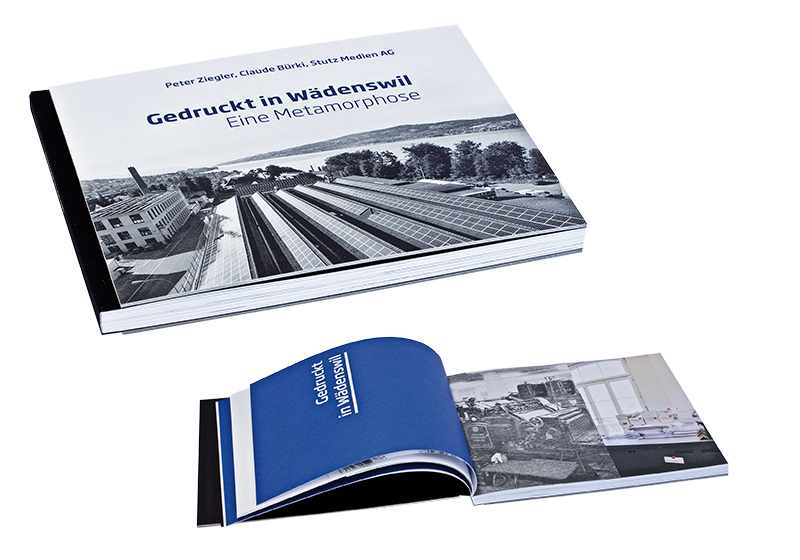
"This book is more than a successful self-promotion. It is a historical and at the same time modern book with depth. What is really exciting is the metamorphosis. After all, the company used to be characterized by publishing products that were published in Wädenswil. When it was possible to earn more from printing than from publishing books, publishing was abandoned. To earn money today, you have to publish again - and on all channels, online and offline. As times change. What hasn't changed is the demand for craftsmanship, typography, printing and finishing. A timeless book on the structural changes in the graphic arts industry and at the same time a successful presentation of one's own work, which deserves the special 'Peter Grob Award'."
Klaus-Peter Nicolay
Compiled by: Anne-Friederike Heinrich
With the "Swiss Print Award" ...
... awards are given to manufacturers of printed matter whose work "whets the appetite for print". Swiss-print-award.ch
The jury ...
... of the "Swiss Print Award" is made up of typographers, designers, advertisers, agency, publishing and printing professionals, and paper experts:
Marco Bieri, Head of Marketing Papyrus Switzerland
Claude Bürki, Freelance journalist, packaging, advertising and PR specialist
Paul Fischer, Editor-in-Chief viscom print & communication
Stefano Gazzaniga, Vice Director Viscom
Anne-Friederike Heinrich, Editor-in-Chief Werbewoche
Klaus-Peter Nicolay, Editor-in-Chief Druckmarkt Schweiz
Jean-Paul Thalmann, Druckmarkt Verlag Zurich


