Head Start Design
MetaDesign has created a new brand identity for the Steiner Group. Unusual emotional colors emphasize the positioning as Switzerland's leading real estate service provider.


Buildings are integral parts of our daily lives. They are the expression of a culture. And the vision of a future that focuses on people and their living space." This is what the brochure says under the guiding principle "Shaping a head start together." The high-quality magazine was designed and produced by MetaDesign in Zurich as part of the rebranding of Steiner.
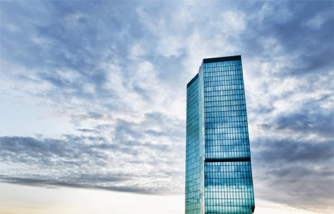
Steiner Group can celebrate its 100th anniversary in 2015. During this time, the former carpentry company has grown into one of Switzerland's leading real estate service providers. Recent prestigious projects include Sihlcity - a dense ensemble of old and new architecture, where a total of four factory buildings have been carefully renovated and combined with new constructions. Another milestone is the collaboration on the Prime Tower in Zurich. The glass tower designed by architects Gigon/Guyer, which has since been decorated with various environmental labels for Minergie and sustainable construction, is considered the tallest building in Switzerland at 126 meters.

In 2010, Steiner Group was acquired by the HCC Group. The takeover by an Indian construction group triggered uncertainties in the market and within the company - Steiner's strategy and organization were revised. To achieve a clear positioning in the market and promote a strong uniform corporate culture, Barbara Fry, Head of Corporate Communications at Steiner- Group since January 2012, launched a comprehensive corporate identity and rebranding project.
Involving process with workshops
It was no everyday task for the creatives at MetaDesign to design a CI for such a general contractor that was as outstanding as it was fitting. The agency in Zurich's Seefeld won the task in a pitch in 2012. One goal in the brief: Steiner should once again be perceived as a quality leader in the development and realization of complex building constructions. Implenia, created in 2006 from the merger of Basel-based Batigroup Holding with Geneva-based Zschokke Holding, is considered the big competitor. Other players in the market are Allreal, Losinger Marazzi and Halter. To reposition the company, MetaDesign first conducted a series of workshops and interviews as part of a participatory process: Discussions were held with executives and experts. In a workshop with a mix of functions and regions, employees searched for common values and visions for Steiner. Customers were also asked in interviews about their perception of Steiner.

An icon of Swiss graphic design
One finding from this research: Collaboration with customers and partners influences the perception of Steiner's quality at least as much as the end product itself - the buildings visible throughout Switzerland. This gave rise to the idea of focusing on these process moments and the associated constructive long-term partnership for the new branding. The slogan for this: "Shaping a head start together." The designers at MetaDesign wanted to make few changes to the distinctive logo, which dates back to the 1940s. The goal was to preserve the character and strength of the lettering while optimizing it to meet the demands of today's media. "We didn't want to simply throw such an icon of Swiss graphics overboard," says consultant Christoph Knecht.
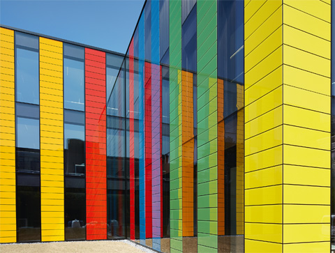
Unusual shades for the industry
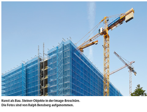
An eye-catching renewal are the emotional colors. Hues that were previously unusual in the real estate industry, such as violet, pink, red and blue, are used in the new Steiner world. The colors create the most impact at the company's most important touchpoint, the countless construction walls with which Steiner's "Work in Progress " can be seen on every corner of Switzerland. In addition to the colorful walls produced using digital printing, new flags are also being used around the construction sites. An important means of communicating the new image is the redesign of the print media and the associated creation of a high-quality image brochure. This also includes selected reference projects. These were photographed by Ralph Bensberg. What is striking about these images is that they have been squared with courage, even for fresh perspectives. In an important first step, the new website was launched "internally" in March 2013 with an event for employees. By the time of the external launch in September 2013, workshops had been held for employees in which the new brand identity and the newly defined values were discussed and anchored. Because only what is lived internally can be communicated credibly to the outside world.
Andreas Panzeri