Metadesign designs brand identity for Europaallee
The Europaallee is being built near Zurich's main station, with eight construction projects scheduled to run until 2020. Metadesign developed all the strategic steps for the new Europaallee brand and designed the entire appearance as well as the opening campaign for the Europaallee Passage.
The central strategic challenge for the emerging brand was to reach all stakeholder groups: SBB Immobilien, tenants, property management companies, consumers, the PHZH University of Teacher Education, a retirement center, workspaces and a hotel. The newly created Europaallee brand offered a suitable brand umbrella for communicating a wide variety of messages, the agency wrote in a statement on Friday. The term "Passage" also names the character of the new, extensive shopping area with Adventure, Outdoor, Sport and Travel as the first of eight parts of Europaallee.
For the visual concept, Metadesign referred to the diversity of urban life that meets in Europaallee. The logo's graphic form is a double row of trees leading to a horizon. The two letters "l" are the supporting graphic elements. Today and in the future, they are to define the framework for all facets of city life in Europaallee. Beyond the logo, the agency developed a visual language, a color scheme, design principles and rules for dealing with typography.
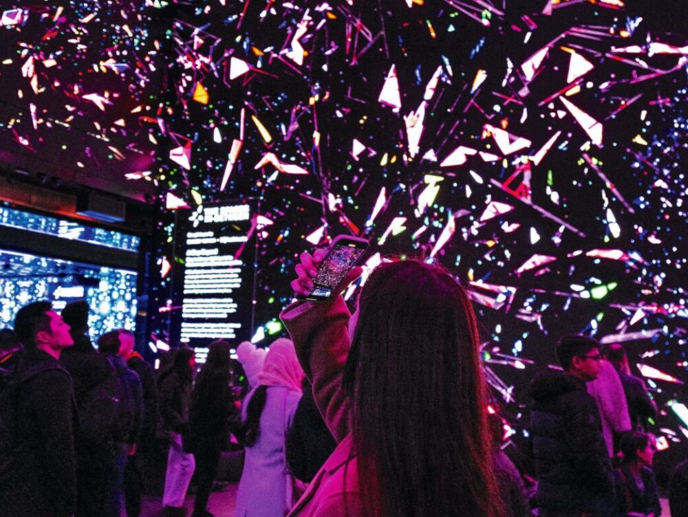
For the opening of the Europaallee Passage, the agency developed a broad-based campaign. Invitations, vouchers, posters and advertisements communicated the motto: "Europaallee is Zurich's hotspot for getting properly equipped for outdoor activities, travel, adventure and sports".


