Blick with new logo, claim and fresh online presence
As of Wednesday, Blick is presenting itself with a new logo, the claim "Blick. I'm in", sharpened values and a refreshed online presence. The rebranding was realized in cooperation with Bodin. Consulting. The new design language of Blick.ch was developed internally.


![]()
In recent years, the Blick Group has continuously developed in terms of content and digitally. To support this continuous transformation after Blick has undergone a rebranding process to make itself more visible to the outside world. As of Wednesday, the Group is presenting itself with a new, contemporary logo, a refined brand promise and a refreshed design of Blick.ch. "Blick's new visual identity underscores our story and what makes us tick," Ladina Heimgartner, CEO of the Blick Group, was quoted as saying in a statement. "As brand values, we have written 'clear, bold, pioneering, close' on our banner. They formed the basis for the development of the new logo and will serve as a beacon for the entire Blick Group in the future."
The new Blick logo is classic and modern at the same time. The lettering specially developed for the logo is intended to appear loose and friendly, with curved "l" and rounded dot on the "i". With white lettering on a red background, the logo remains true to the brand's tradition. "The new design of the logo is future-oriented. Despite rounding, it continues to show corners and edges - and does not forget the roots of the look." says Astrid Gartenmann, Head of Commercial Management at the Blick Group and responsible for the rebranding, which was carried out together with brand expert Frank Bodin. The logo works on all channels - digital, TV, social media and print. An audio signet will also make Blick acoustically unmistakable in the future.
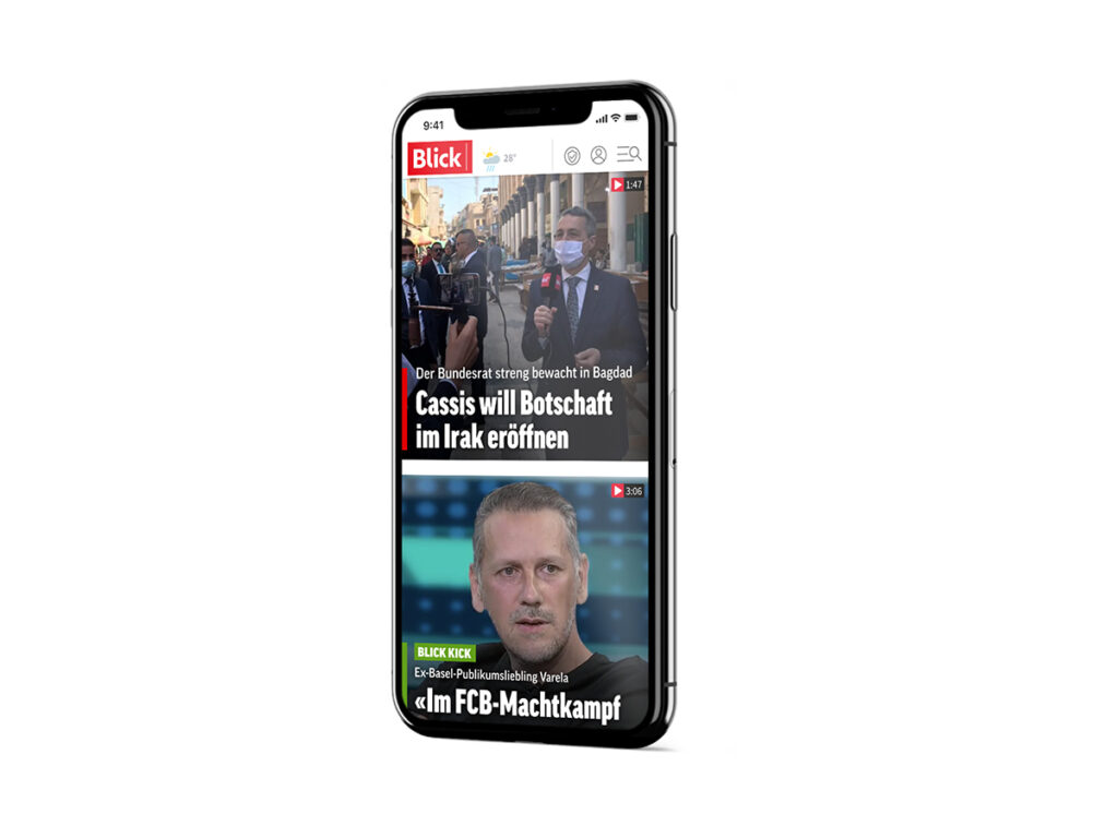
Refresher from Blick.ch
The transformation of the Blick brand will also be reflected in the appearance of Blick.ch from tomorrow: The adapted UX design was further developed on the basis of user surveys. The new online presence is intended to be clear, concise and yet powerful - which is to be reflected in the font variants and sizes as well as in the color. "The new, user-friendly design underscores what Blick is today: the leading digital news platform in Switzerland, where anyone and everyone can find information and entertainment," says Katia Murmann, Head of Digital at Blick Group and Editor-in-Chief of Blick.ch. "We are fast and go into depth, explain, classify and comment. With the new appearance, we offer our users the best possible experience - and will continuously develop our products for them."
The new claim "Blick. I'm in." is intended to clearly express Blick's intention to put readers at the center, and at the same time ties in with the legendary slogan "Blick was there. As of June 1, Blick is launching its online offering for French-speaking Switzerland.