
Brand Check "Burberry": Good Knight, Sir!
Heinrich Paravicini from Mutabor takes a close look at brand relaunches and brand designs for Werbewoche.ch. This time: the redesign of the luxury fashion brand Burberry.


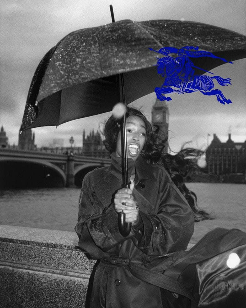
Daniel Lee recently became Burberry's new creative director - and what do you do as the new head of a brand? Exactly, you first clear away the visible signs of the predecessor and create something new - in this case the logo.
Interestingly, this one is not new at all. The so-called "Equestrian Knight" won a design competition in 1901. In 2018, Ricardo Tisci had disposed of the logo. Now the "Equestrian Knight" has been unceremoniously elevated back to its brand pedestal, and the "without" era has been made out to be a five-year fashion faux pas. So much for politics.
Two things in particular are very exciting about this: Firstly, the decision to abolish the recently introduced grotesque lettering again and replace it with an elegant historical antiqua pours oil on the fire of a debate that is ongoing in specialist circles. At issue is the fact that many fashion brands have replaced their unique logos with simple block letters in recent years under the guise of internationality and digital visibility - including Balmain, Balenciaga, and most recently Boss (Werbewoche.ch reported). Some, like Saint Laurent, have already rowed back. Now also Burberry.
Is the Antiqua era dawning? It's probably too early to say. But it brings me to the second interesting point: it is striking that the new Burberry appearance, including the new campaign by Tyron LeBon, breaks with a globalized brand look and deliberately stages historicizing Britishness in an almost romantic way. It's as if the brand wants to reflect on itself again and defy egalitarianism. Downright chivalrous!

Tisci and Lee's predecessor Christopher Bailey had already proven in the 2000s that a traditional brand can indeed be extremely innovative and internationally successful, precisely because it is consciously located. And indeed, this principle works very well again in today's crisis-ridden times. The illusion of the global community seems to be dissolving and national (in)virtues are booming again. Positively speaking: Identity is back in fashion - that's a good sign.
* Heinrich Paravicini is founder and creative director of Mutabor.

