Lancia" brand check: Un Colpo di Lancia
Heinrich Paravicini from Mutabor takes a close look at brand relaunches and brand designs for Werbewoche.ch. This time: the redesign of the Lancia car brand.


There's life in the old dog yet again. This also applies to car brands from time to time, even if most attempts at revival fail - let's remember Borgward or DeLorean. The brand that is the subject of this article now only produces one vehicle and is well on its way to becoming the next brand zombie with a glamorous history: Lancia.
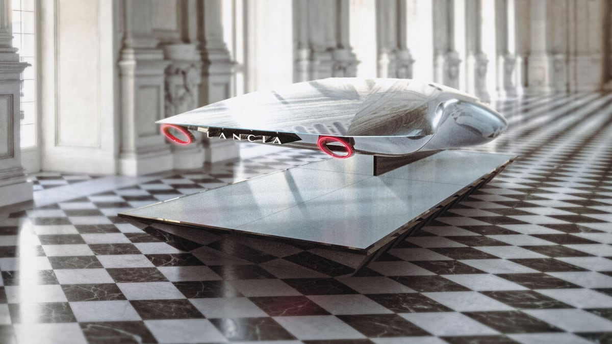
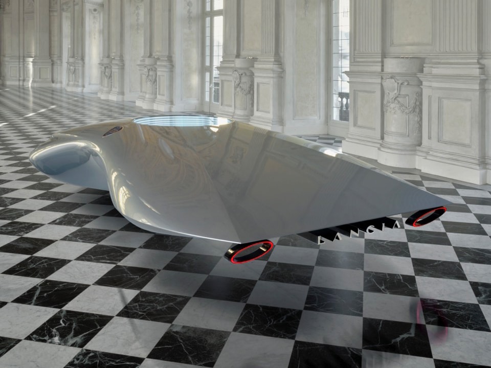
In the ears of many automotive enthusiasts, this name still has a good ring to it, recalling classics such as the Aurelia, Flaminia or the rally legend Stratos. The Stellantis Group now wants to take up this great tradition again and presented a sculptural design study at the end of 2022 to mark the brand's resurrection, which had one thing above all: no wheels. In other respects, too, it was more reminiscent of a computer mouse from the 2010s - after all, it is supposed to anticipate the future design language of the recently all-electric brand (of course!) Lancia. The first new vehicles with wheels are to be expected at the earliest 2024. We can be curious, but already some (unauthorized) images are circulating through the net.
In addition to the sculpture, a completely new corporate design was also presented, which is supposed to be based on its logo predecessors from successful days - but still comes across as very "pure and radical" - that's how Lancia calls its new concept "PuRa". So much for the official diction, peppered with all sorts of elaborate 3D videos and slightly clichéd Italian lifestyle in moving images.
The logo itself represents a return to its semantic origins - and still manages to get everything wrong. The lance with the flag is practically impossible to decode. Furthermore, the design has considerable formal flaws, as shown by the black-and-white representation, which is to be used primarily digitally. It is practically unrecognizable at small sizes. Why such a rather clumsy old-school 3D logo is presented in our digital age is probably known only to the designers themselves. Better there is everything else that is in the brand construction kit.

In any case, they have succeeded here in making you immediately think you are in an elegant, Italian premium world when you see the brand: The Lancia typography, colors, materials and graphics, however, tend to speak a language that comes across as less modern than nostalgic in today's automotive environment. Is this what an automotive renaissance for the 21st century looks like? One wonders who this brand will inspire in the future. Certainly not Gen Z or millennials. It's more likely to appeal to the older generation, if they can be dissuaded from their ultra-modern Mercedes, Ferrari or Porsche models.

In any case, we can hope that the announced exciting new Lancias will go on sale before the actual reminiscent target group passes away.
* Heinrich Paravicini is founder and creative director of Mutabor.