Brand Check NBA Hoop Cities: Things are moving here!
Heinrich Paravicini from Mutabor scrutinizes brand relaunches and brand designs for Werbewoche.ch. This time: the successful motion design of the NBA for their new documentary.


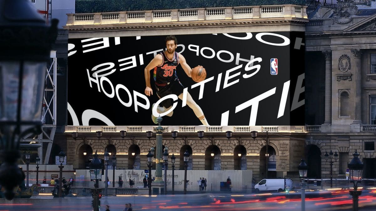
 Something has to move. Especially in modern branding. So it's hardly surprising that the sports market has been relying on motion design in terms of identity for years. This can be seen above all in the brand presences of the European soccer leagues, but also in games such as Fifa or the club identities of the clubs. Some of them lack the right touch: We see appearances with too many effects, shades and visual bling-bling. A great exception is the NBA's identity package for its new series "Hoop Cities": a documentary about culture, history and community in European basketball, presented in eight European cities.
Without mica effects
This identity is great because it does without any glimmer effects and relies solely on moving typography. This typography - kept purely monochrome - creates a flexible framework that generates a unique visual appearance, from the logomarks to the animated trailers to social media and out-of-home. Nathan Crawford, executive design director at Saatchi & Saatchi UK, the agency overseeing the project, says they wanted to translate storytelling directly into design. And they succeeded: The dynamic setting of a basketball game in the confined space of the court was here congenially transformed simply into a recognizable and comprehensive identity design.

Of course, the aesthetics of moving type is not entirely new: Studio DIA from New York and Geneva, for example, has been working with it for years, for example for the platform provider Squarespace. Nevertheless, it is always a special art in branding to use a new technology not only as an effect, but in an absolutely meaningful way. That's why the "Hoop Cities" identity is my favorite this month. It remains to be seen if the NBA och will be heard and seen more in terms of progressive branding. Anyway, with this first throw, there were "three points".
* Heinrich Paravicini is founder and creative director of Mutabor.