Brand check Citroën: Why the square has to go round (again)
Heinrich Paravicini from Mutabor takes a close look at brand relaunches and brand designs for Werbewoche.ch. This time: the Citroën figurative brand through the ages and its potential.


I am German, but grew up in Paris. I was therefore not socialized to the VW Beetle, but to the Citroën "deux cheveaux". In addition, my parents lived in Boulogne Billancourt in the 1970s - not far from the large Citroën plant. So the brand with the double angle has accompanied me since my earliest childhood. And in the days of my childhood, this angle was one thing above all. Pointed, angular and aspiring. No other brand had such a logo.
With the introduction of the legendary DS (Déesse) in 1959, this very pointed double angle was born. The oval, which had dominated the previous 40 years, disappeared completely at that time. From then on, the soaring arrow-shaped angles marked an era of innovation: DS, Ami6, SM, CX - until the brand was taken over by Peugeot PSA in the late 1970s. As a result, there were more and more identical vehicles from both brands. Citroën was unable to break out of this grip for many years.
It is certainly no coincidence that with the spin-off of the DS product line into a sub-brand in 2009 - 50 years after the launch of the DS - Citroën's identity finally began to wobble. From now on, the noble and elegant flair was destined for DS premium cars. These also adopted the character traits of the pointed double angle to their very skillful logo. Rest-Citroën, in turn, was now to become the creative brand for everyone. The result: in the years from 2009 onwards, the brand was apparently continuously on a creative quest itself when it came to its logo, as the Boomerang-like angles and the misplaced, pseudo-contemporary lettering revealed. Already in 2016 - seven years later - it had to be revised, five years later another time - which, interestingly, is kept quiet in the official logo history.
In 2021, PSA and Fiat Chrysler merged to form the Stellantis Group. And, oh wonder: it seems that - in spite of the fact that Citroën was now demoted to one portfolio brand among many - they decided to make a real radical move again, which was presented in September 2022. This succeeded less with the very default claim "Nothing moves you like a Citroën" - you are welcome to replace the last word with any car brand - but with the logo and brand design, the clear emancipation from DS Automobiles, which has also been operating as a fully independent brand since 2015, has now been achieved.
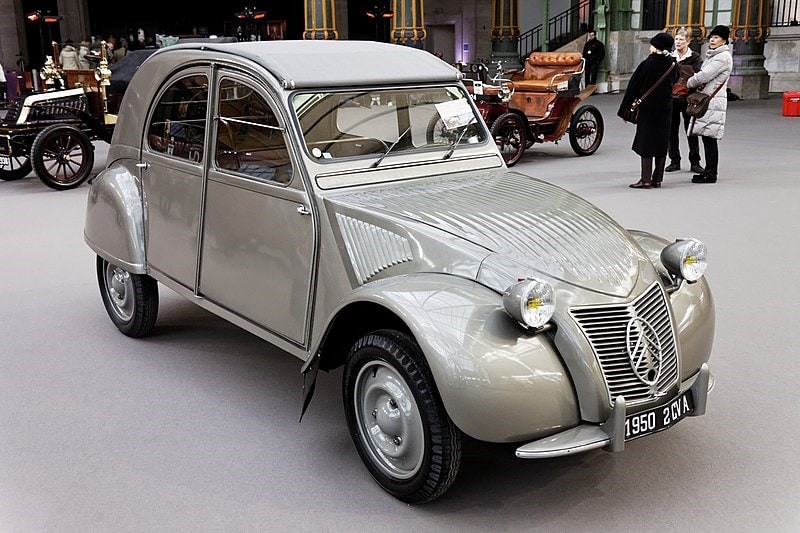
After 13 years of the will-o'-the-wisp, a branding is emerging that can make Citroën a proud brand again, independently and without melancholy after the lost DS inspiration. And this under the sign with which André Citroën had started his automobile production in 1919: the double angle in the oval. Incidentally, the origin of the "deux chevrons" is the double arrow toothing of gears, with the production of which the company had already made a name for itself before entering the automotive market. On the Type A - the first European mass-produced automobile - it was used in an oval badge.

With Citroën's electric future, this very symbol is now being revived - the spirit of large-scale production and the compact Citroën 2CV from 1950 are coming back to life here: "Revolutionary and courageous cars that break with traditional rules of industrial production and usher in a new era of (electric) family mobility," is how Citroën CEO Vincent Cobée comments on the new brand identity. And I think he's basically right.
Nevertheless, it remains to be criticized that unfortunately once again the consistency in the formal is missing. The line thicknesses and the proportions of the sign could have been oriented a bit more to the elegant original - then no Easter egg would have resulted. And why couldn't you bring yourself to allow your new, really well-done corporate typeface in the brand logo as well? Instead, the typographic accident of 2009 was merely ironed out. Too bad.
All in all, a big step in the right direction - but not yet consistent enough. So I expect further optimization in the next few years. And this will certainly come soon.
* Heinrich Paravicini is founder and creative director of Mutabor.