Brand check: Sprite relaunch - Finally fresh?!
Heinrich Paravicini, founder and creative director of the Hamburg agency Mutabor, takes a close look at brand relaunches and brand designs for werbewoche.ch. This time: Consistently refreshing simplicity at Sprite and TurnerDuckworth.


 When the client and the agency responsible give a brand a fresh kick, the ideal result is something like the current Sprite relaunch - for me one of the best brand relaunches of 2022 so far!
Sprite, launched in 1961 and present in Switzerland since 1968, is the second largest brand of the Coca Cola Company with twenty billion in annual sales - and has tried to reinvent itself eleven times since the "Swinging Sixties". In the last 8 years alone, there have been three revisions: Sprite was a brand in search of itself, caught in the staccato of visual trends.
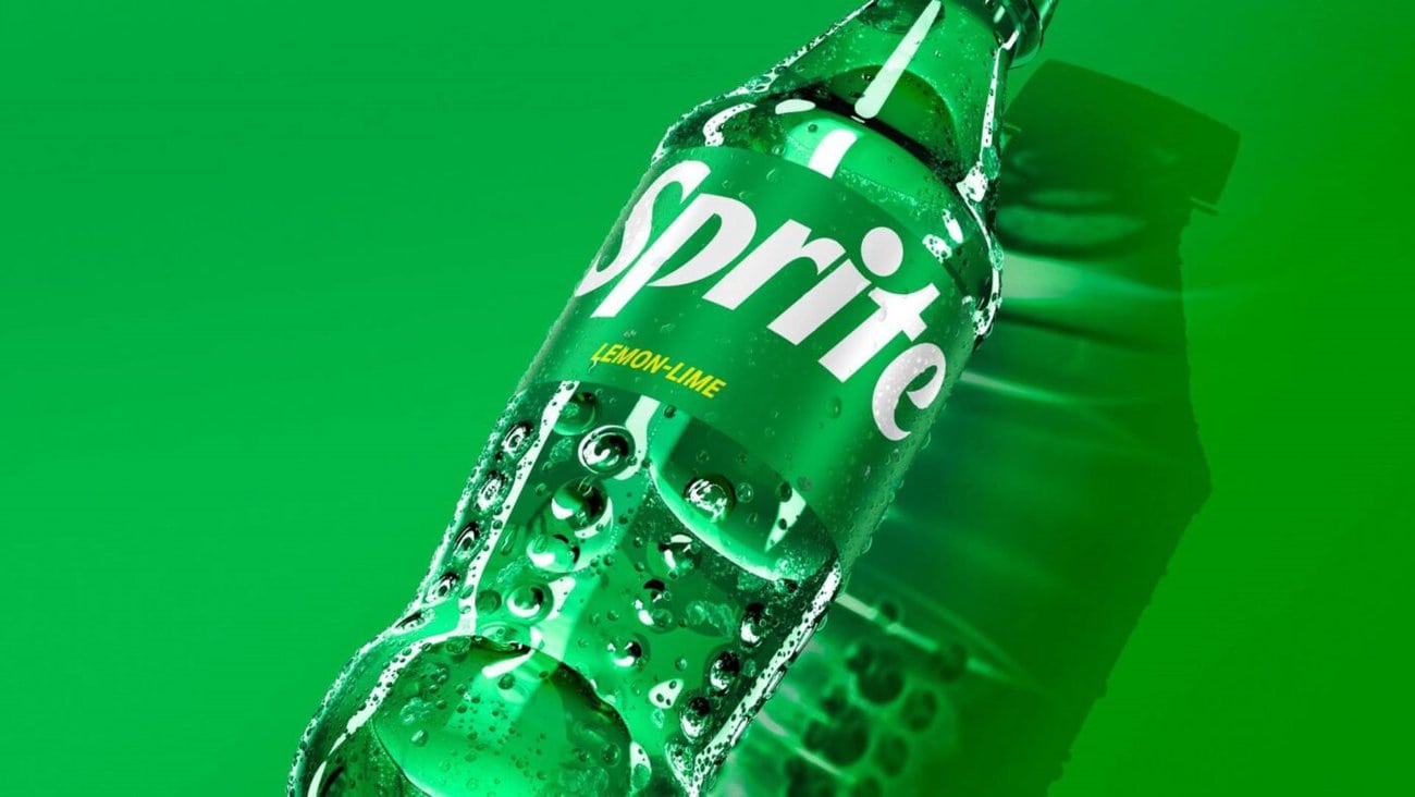
This time, however, there was no branding piecemeal along with formal gimmickry, but a global brand platform was created that combines visual quality and content. The concept: "Heat happens. Global Brand Director Shrenik Dasani talks about being the brand for a cool head in a "heated", fast-moving world (whether this is meant to involuntarily adopt a shrugging attitude towards global warming is something I'll leave uncommented. In any case, the bottles are now truly recyclable for the first time!).
The professionals from TurnerDuckworth (London, San Francisco) are responsible for the global relaunch of the brand and design starting this summer: It was they who developed the legendary Coke relaunch in 2008 (Cannes Design Grand Prix included). TD cleans up and strengthens the assets that really create character: Sprite comes across more purist than ever. White and black lettering on a green background distinguishes between "Classic" and "Sugar-free" (just like Coke); the bottle is clear and can thus be recycled globally. All brand elements are given a function and subordinate to the XL word mark. This is a trend with which many consumer brands are currently generating "shelf impact" in retail and online. This XL word mark was also used to develop a special decorative typeface, which turns every ad into a brand ambassador "in detail".
Conclusion: Sprite has managed to release new power and modernity from simplicity. Freshness drips from every pore of the visual appearance. Cheers