Daniel Kraft gives IST tourism school a new design
Die IST – Höhere Fachschule für Tourismus & Outdoor hat nach dem kompletten Umbau der Zürcher Schulräume nun auch eine neue Corporate Identity. Für die Umsetzung zeichnet der Markenstratege Daniel Kraft verantwortlich.


The pandemic has had a major impact not only on tourism, but also on the requirements for tourism education. The IST - College of Tourism & Outdoor has taken advantage of these drastic changes to completely reorient itself.
The aim of the brand relaunch was to sharpen the positioning of the IST School of Tourism and to make it visible in the dynamic tourism and outdoor industry with a modern, self-confident image. Now IST appears with modern remodeled classrooms in Zurich, an expanded range of studies, flexible lesson design and a new CI/CD including a new website.
"We are very pleased that with this relaunch, not only does the design come across as fresh and modern, but we also meet today's technical requirements," says Managing Director and Overall Head of School Nicole Diermeier. "Our new appearance strikes a chord with the times. It is modern, simple and high-quality. It reflects the quality of IST," adds IST Marketing Manager Lory Gauch.
Daniel Kraft is responsible for the conception and implementation of the IST relaunch. "Logo, visual language, typeface and color scheme - all elements of the new brand identity play together to make IST's vision a long-term experience for the relevant target groups," explains the brand strategist.
The IST logo has its origins in the Swiss cross and, through its dynamic cut, simultaneously stands for departure, development and progress.
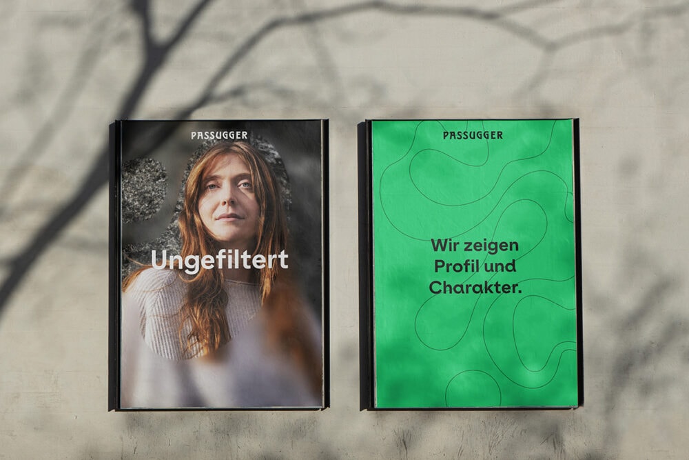
The IST imagery is intended to evoke emotions and shows people, places, being on the road, the vast tranquility and urban life. The images are meant to invite you to consciously experience the moment and to discover the world in a fascinatingly close and surprising new way.
The color world with the characteristic IST colors strikingly and confidently underline the understanding of and the claim to tourism and outdoor.
The IST typeface is modern, unobtrusive and flexible, making it ideal for authentically communicating the full range of facets of the tourism and outdoor industries across all channels.
Responsible at IST, Higher School of Tourism & Outdoor: Nicole Diermeier (Executive Management), Lory Gauch (Marketing Management). Conception and implementation: Daniel Kraft (brand strategy, project management), Israel Moreno (design), Clau Isenring (text).