Neum: Rebranding and package redesign for Lattesso
The Lucerne-based agency Neum has implemented a comprehensive rebranding for Lattesso. Among other things, the cold coffee drink appears with new packaging. The focus of the rebranding was on differentiation and a stronger brand impact at the POS.


Neum helped Lattesso achieve a new brand identity as part of a long-term collaboration during 2020 and 21. During the implementation, particular attention was paid to ensuring that the rebranding was based on the philosophy - Lattesso's high quality standards and perfectionism.
Although the desire for a new, fresh, contemporary look was very present, the previous brand presence was not to be neglected. Distinctive design elements, as well as the look and feel of the brand, were not to be discarded. The Lucerne agency therefore aimed rather at translating the brand appearance into a new aesthetic, which should convey the core values of the brand even better: Highest quality to go, Convenience can also barista quality.
In the course of an extensive, lively exchange with the customer, the brand core was defined at the beginning of the project. Rational USPs were translated into emotional core values and the fundamental concept of the new brand appearance was developed.
In a second step, the design process began, in which Neum worked closely with the client to create, discard, select and further develop various designs.
The decision was ultimately made in favor of a simple, uncluttered design that puts the brand color copper at the center. Inspired by menu boards in coffee houses and old-school Dymo tags, the headlines were designed as white text elements on a black stripe. The imagery is meant to pick up on the barista aspirations, the high level of craftsmanship and the authenticity of the brand.
Parallel to the development of the corporate identity, work was carried out on new packaging. Central elements such as the Lattesso bean and the belt in the center of the cup were retained. For the sake of recognition and simplicity, the logo was stripped of the "café" suffix, which is also intended to further differentiate the brand from its competitors. This maximum reduction to the essentials is intended to make Lattesso a brand with real independence and strength. The cups are now more colorful, which should significantly improve visibility at the point of sale and thus provide the necessary impetus for the purchase decision. The variety colors are more dominant in the new design - the cup base has been recolored, while the striking belt with the bean signet now shines in the brand color copper. Rather distracting elements have been removed and the amount of information reduced. The result is a clear design that stands out stylishly and simply from the refrigerated shelf.
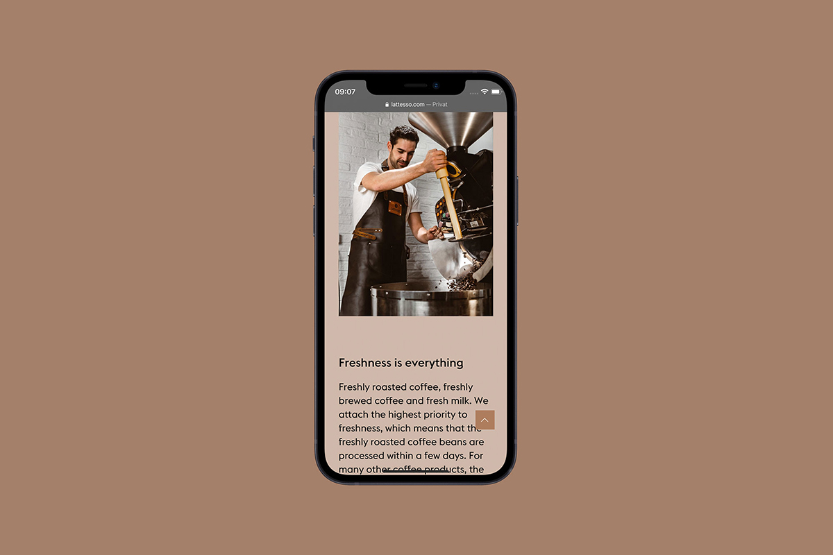
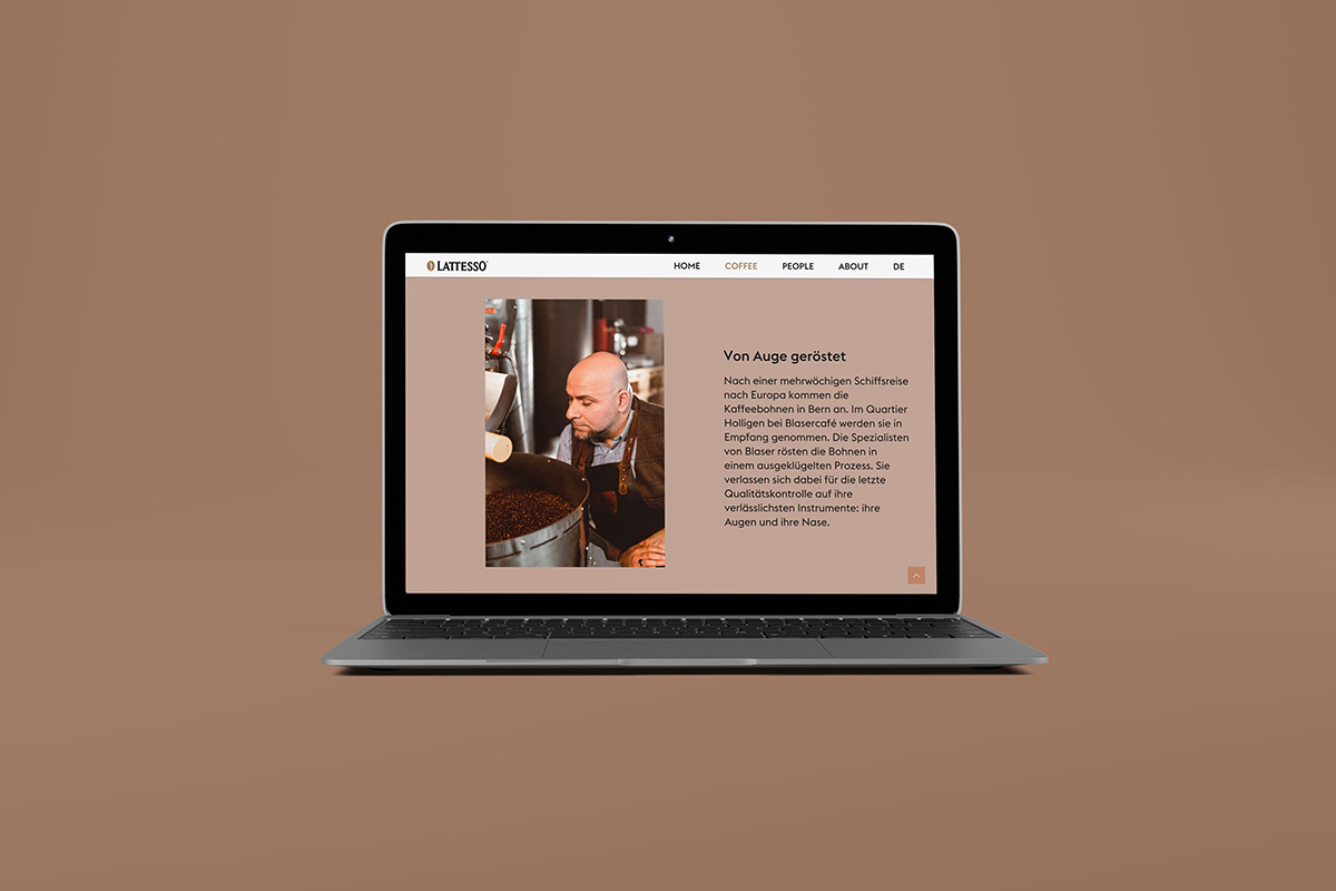
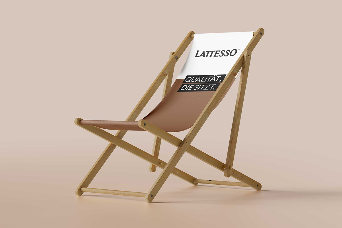
After the new corporate identity was adopted, Neum worked with the client to implement and apply the new design guidelines. A new website was developed. And cardboard trays, all merchandise, the brand's print media, field service vehicles, as well as existing advertising measures on all channels appear in the new Lattesso design.


Responsible at Neum: Lars Kienle (Project Management); Lars Kienle, Joël Wyss (Concept & Strategy); Olivia Hubli, Michael Kunz, Lars Kienle, Joël Wyss (Design). Photography: Dino Reichmuth, Marius Wickli (short picture). Web Development: Jonas Holzer.