Pinktank for Sitem Island: A swirl is worth a thousand words
Pinktank has developed a branding for the competence center for translational medicine and entrepreneurship Sitem-Insel that is intended to appeal emotionally to both laypeople and professionals alike.


In a playful workshop led by Pinktank, a common target image was created and the corporate DNA was developed. It quickly became clear that an analogy had to be found for the complex term "translational medicine".
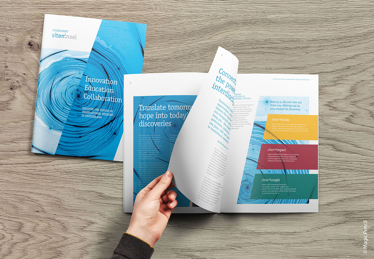
The solution is a fractal pattern: the "abstract spiral vortex". The vortex stands for infinity - research can go on and on - and the spiral for energy - translational medicine should allow research to benefit patients as quickly as possible and in the highest quality. This story is intended to embody what Sitem Island is and wants to radiate: the courage to break new ground.
The Magic Pencil agency then added further elements to the story, such as the verbal and graphic language, which completed the new Sitem Island branding. The story was broken down into all of Sitem Island's communication media and brochures, factsheets, website and CI/CD were created.

Responsible at Sitem-Insel: Stefanie Hofer (concept, strategy, project responsibility). Responsible at Pinktank: Cordelia Hagi, Rolf Kleeb. Creation: Simonhofer Creative, Oliver Hallberg Photography. Responsible at Magic Pencil: Fredrik Karlström.

