What image colors convey in company logos

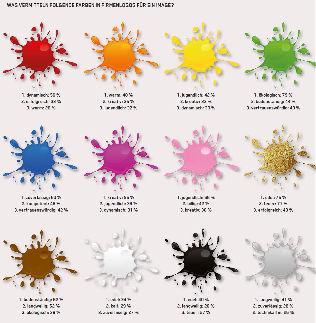
MK OPINION Dynamic, youthful or boring? An online survey by MK shows which corporate image twelve colors in logos convey and which Swiss logos are particularly successful.Almost 120 people took part in our survey on colors in corporate logos. The respondents rated twelve colors and indicated which image they convey.The result is clearest for the [...]

Almost 120 people took part in our survey on colors in company logos. The respondents rated twelve colors and indicated which image they convey.The result is clearest for the color green: 79 percent associate it with an ecological image. The color gold conveys a noble image (75 percent), pink a youthful image (66 percent), brown a down-to-earth image (62 percent) and blue a reliable image (60 percent).The message of the color white is the least clear: 34 percent associate it with a noble image, to 29 percent it appears cold and to 27 percent reliable.The following infographic can be here can be downloaded as a PDF and printed out.

farben_logos

Which Swiss company logo do you find best and why?

logo_migros-1
"I maintain that everyone who lives in Switzerland probably knows the orange M of Migros. Whether Mr. Duttweiler chose the orange color because he thought about what customers like and what it subconsciously communicates, or whether it simply reflects his character traits, I don't know. If both fit together, it is in any case very effective. Hats off to this great achievement!"Romer Tino, Energetics + Massage Tino Romer"Migros, authentic and simple"Sieber Yvonne"Migros. Simple, elegant and memorable."Colle Fabio"The logo of the airline Swiss is by far one of the most successful in the Swiss brand landscape. With only two colors (red/white), a simple lettering and an additional "icon" which can also stand on its own and be recognized. These are ingredients for a successful logo."Ramic Eljub, news aktuell (Switzerland) AG"Very simple. That of SWISS. It's nothing but the Swiss cross. But it says more than a thousand words; it gives a personal identification with its origin like no other. No matter where in the world you encounter this logo, it evokes feelings of home and security."Tobias Treichler, St. Gallen-Lake Constance Tourism"Swiss airline. The logo combines CH quality (CH cross) with airline service (tail fin)."Rüegge August, Plumor AG, 9016 St. Gallen
emmi
"Emmi (milk processing company) - the word picture mark is simple, memorable, conveys competence and trust, and with the simplicity is also very authentic - crowning glory of milk."Rava Erich, 5thSense Communications"Emmi, with playful integration of the Swiss cross."Felder Matthias, Kobalt AG, Lucerne
2000px-Victorinox_Logo
"Victorinox: clear and distinct recognition".Müller Birgit, Medela AG"Victorinox: simple, unique, clearly understood".Logk Andreas, management tools"Nestlé - simple - vibrant because of birds - instantly recognizable even in black and white - trustworthy- consistently pulled off for years."Giger Gerold, Kaiser Data AG Wollerau"Nestle: lettering and color emphasize the security of a nest and the corresponding care."Rope head Heinrich, practice"Swisscom: distinctive, innovative (multidimensional: 3D as well as audio +video), emotional, modern."Peters Karsten, Ifolor AG"SBB - a classic and everything in it: Color, Swiss cross, movement. Simple and yet not boring. And any child can paint it."Schaffner Adrian, evoq communications AG
nespresso
"Nespresso: Dynamic. High-quality. Noble. Modern and yet a simple logo which can be used in all areas such as product,advertising etc."Thöny Eugen, Thöny_Consulting
Valida_Logo_RGB_Online
"Valida in St. Gallen. Unites many messages: figurative mark "V" can also be recognized as a heart (social enterprise). Three colors for three business areas. Overlap below of social and economic mission."Limoncelli Prisca, Valida
hero
"Hero: classic logo, long-lasting and successful lettering with r as an opened can of food"Salomé Weber, UFirst Group
coop
"Coop, it's always adapting to modernity without being trendy."Hunziker Ingrid, Connecta Kommunikation & Marketing Services GmbH
rapid
"Rapid: Simple, clear, down-to-earth and authentic. Just like the company, its products, services and employees who shape the brand every day."Zumsteg Lukas, Rapid Technic AG
omega
"Omega: good typography and color"van Zweden Mirjam, mvz visions
wyss_garten
"https://www.wyssgarten.ch/ Readability, product reference, simplicity, reproducibility, recognition value."Bruppacher Walter, quintes
laederach
"Läderach - chocolatier suisse: simple, clear, expressive and noble".Stuber Diete,r JUTZLER AG
pro-tent
"Pro-Tent AG, is not only P485 as with all and still reference to Switzerland with Matterhorn."Black Roger Pro-Tent AG
mcdonalds
"McDonalds -> could it be any simpler? But instant recognition."Vonarburg Esther SCHURTER AG
ems_chemie
"Ems-Chemie stands for stability, down-to-earth, successful."Eggenberger Daniel
blumen_lafeur
"Flowers Lafeur, authentic and expressive. Nothing too much, nothing missing."Keller Sonja, Customer Dialog
logo_swissheart_claim_d
"Swiss Heart Foundation. Clearly recognizable that it's about the heart and that there's something wrong with it, as well as that the organization can help and that it's Swiss."Hänni Sibylle, SANITIZED AG"Good examples: -SWISSCOM: Blue = communication, red = active, determined, competent in leadership. Only the image flow should go from the bottom to the top right, i.e. mirror side to today's brand image. - SVP logo. Green, yellow and red Bad examples: - FDP logo: Formerly with red, blue, white. Stupidly they took out the RED (leading color). - Ski suit of the cross-country skiers: Black does not go in the sport at all, totally impossible! It can also be proven. A "no go""Keller Hans Rudolf, mental.ch"Every color has its purpose and meaning, there is not the color, but it is the colors."Boog Hubert, RTK Medientechnik AG

More articles on the topic