Ginetta gives the PostFinance app a new look
The Ginetta agency wants to make life easier for users with the new PostFinance app. Through an intuitive structure, they always keep control of their finances. In addition, the new app also stands out in the dark with a fresh color concept.


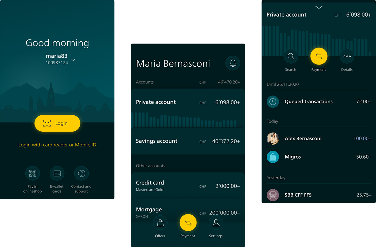
The PostFinance app is designed to give users the feeling that banking processes do not have to be complex and tedious. "Mobile banking mostly happens on the go. You don't have much time there. That's why we wanted to make the app as efficient as possible," explains Martin von Siebenthal from Ginetta. On the home screen, only those actions are displayed that are actually used frequently, such as account balance, payment and transfer functions, and notifications.

Banking app as a digital flagship
Mobile banking is playing an increasingly important role. This is also changing the significance of banking apps. For banks, they are becoming an important digital flagship. "The app stands out not only in use, but also visually. It clearly feels like PostFinance without putting the brand too prominently in the foreground," explains Jessica Müller, designer at Ginetta. Ginetta deliberately stuck to the familiar PostFinance yellow and complemented it with the contrasting color petrol.
50 Shades of Petrol
One of the important new features is the Dark Mode, which allows users to comfortably operate the app in the dark. However, instead of the usual black and white, different shades of dark petrol were used.


